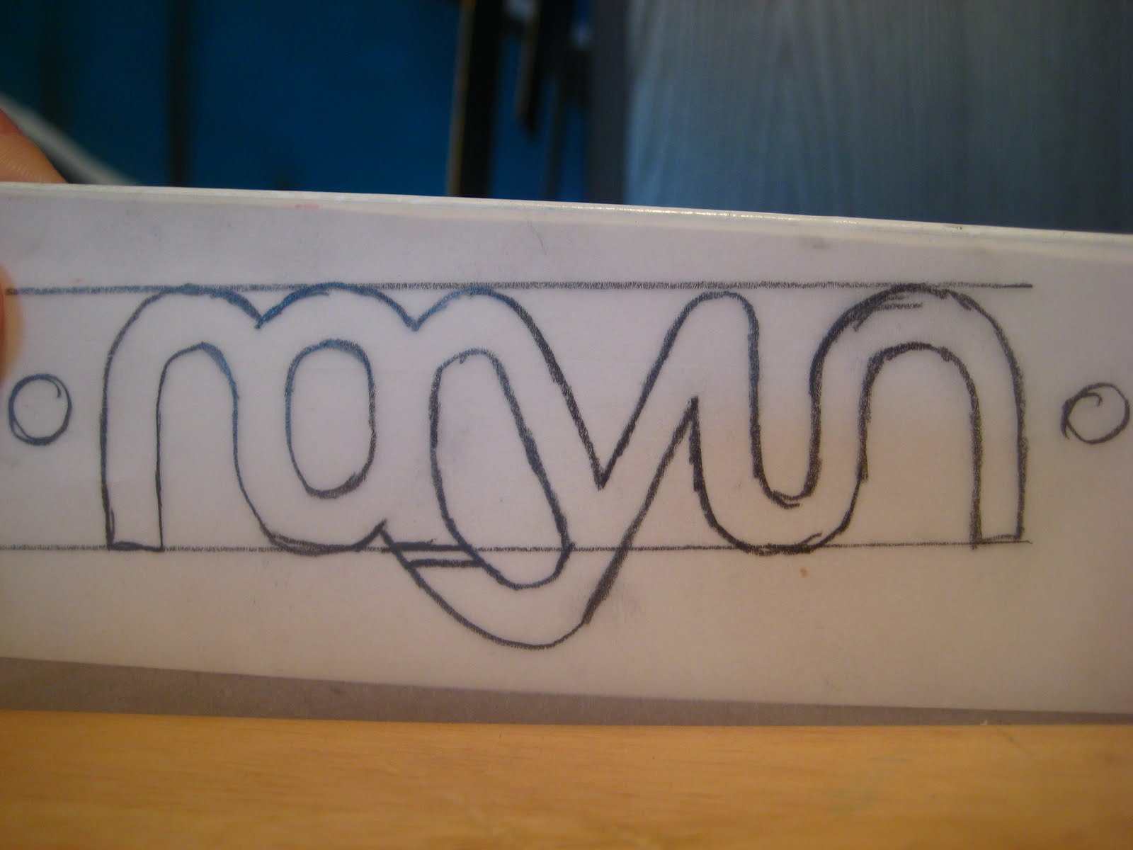
I decided to redo this project for my portfolio. I felt that with a few changes this project could be one of my strongest pieces, so I decided to revamp the majority of it. I started on making a new logo which I carried across the stationary and brochure. When coming up with the image for Rayun we decided that the to make the colour scheme a mix of earth tones. Time for printing came and I decided to go with a non traditional paper stock, something like a linen stock. It has a very deep texture to it, when printed on gave it a weathered earthy look, which you can see in the last photo posted below. Here is the new logo sketch as well as a one of the revamped illustrations, and of course the stationary and brochure. I hope you enjoy this project, I believe it is at the top of my list for portfolio pieces.