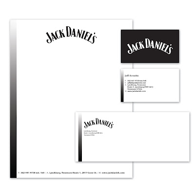
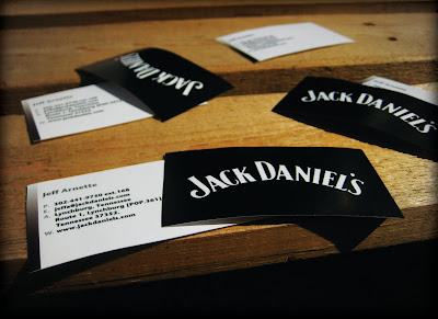
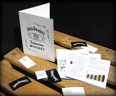
I chose to switch the normal color scheme and make white the more dominant color over the black. I kept it clean and direct because I feel that's how this type of brochure should be viewed.
I have a digital presentation for the stationary. For the brochure I decided to shoot photos of the brochure in an environment. I feel it adds a lot more interest to the subject. Eventually I plan to present all of my portfolio pieces in a way similar to this.
Hope you enjoy!


