Thursday, December 9, 2010

Labatt Blue re Design

Earlier last week I had an interview at Backwell Design Studio in London, Ontario. The interview went well and I ended up getting the "test". The test was a re design project for the Labatt Blue 341 ml bottle as well as the 24 carton. I also created new logos for each concept. I submitted three designs for the project, all with full 3D versions of the bottle and case.

Each Image I post will have a brief creative rationale as to why I made the design choices I made. I hope you enjoy this project, I had a lot of fun creating it.


Friday, July 9, 2010

Generator Newsletter

While I was on my internship with Generator Design I had the opportunity to work on a few email blasts. One of which was for the monthly Newsletters that they had been putting out.

My project was to create a teaser that would inform all receiving clients about the up coming re design for the Generator website. The idea was to build up the anticipation so to speak. I had pitched a few ideas to the bosses. We eventually narrowed them down to the idea bellow. A machine oriented layout with gears and ... Just have a look, describing the layout doesn't do it justice. Hope you enjoy.


Wednesday, June 30, 2010

Rayun

This is another school project that was given to us in second year. The original assignment was a three person project, combining the Interior Design program with the Graphic Design program. The challenge was to invent a product that you would be launching in a trade show, much like the annual North American International Auto Show. The Interior Design student was in charge of creating a scaled down model of your display. The Graphic Designers were in charge of creating the graphics and all things supporting the display. Including the logo, stationary, brochures, posters, etc.

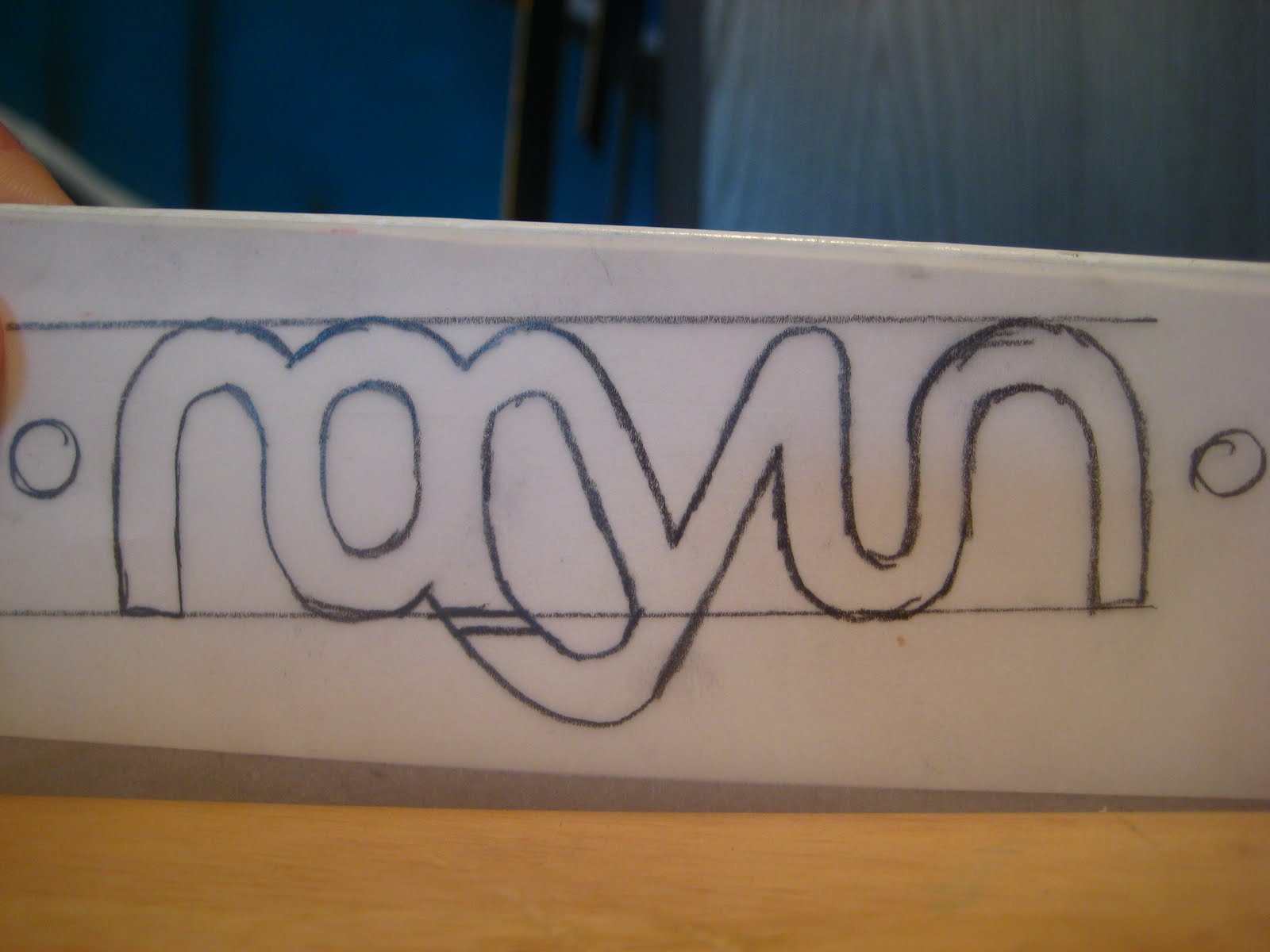
I decided to redo this project for my portfolio. I felt that with a few changes this project could be one of my strongest pieces, so I decided to revamp the majority of it. I started on making a new logo which I carried across the stationary and brochure. When coming up with the image for 
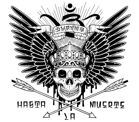
Rayun we decided that the to make the colour scheme a mix of earth tones. Time for printing came and I decided to go with a non traditional paper stock, something like a linen stock. It has a very deep texture to it, when printed on gave it a weathered earthy look, which you can see in the last photo posted below. Here is the new logo sketch as well as a one of the revamped illustrations, and of course the stationary and brochure. I hope you enjoy this project, I believe it is at the top of my list for portfolio pieces.


Saturday, June 12, 2010

Europe Trip!

As some of you may or may not know, I recently went on a two week trip around Europe. We visited Paris, Amsterdam, London, Rome, and a few places in Southern France (Nice, La Ciotat). Yeah I know, a lot of traveling to cram into two weeks. Believe it or not I took 11 Gigs of photos and videos. I have been editing a few and thought I should use them for my next blog post. So here are a few of my favorites. Enjoy!


Wednesday, May 26, 2010

Zombified #4

Here is the newest Illustration in my Zombified series. I had been looking for someone in a different age group for my next illustration in the series and I stumbled across the perfect candidate. My friends little brother! He was more than happy to pose for a picture that would be used to turn him into a zombie. So after uploading a few shots I had snapped, I got to work. As always, here is the reference shot, original sketch, and final illustration.

For the next piece in the series I want to branch out in a different direction. Possibly creating a million year old Mummy or a night walking Werewolf, we shall see. Stay tuned to see the progress, Enjoy!


Sunday, May 23, 2010

Eat- The Real Food Company Pt. 1

In my third year Design & Layout class our teacher gave us a large branding project. The company was called Eat, and the set up is that they were to re brand their entire image. I wont go into it too much detail because I will be posting the final keynote presentation that I made. It is pretty heavy in copy because I wanted to explain my choices in detail. Please note that the layout of the slides has been compromised because the original presentation had animations to the elements.


Eat- The Real Food Company Pt. 2


Saturday, May 22, 2010

Lizard Illustration

Here is an illustration I did back in my second year of school. We were given the choice between any exotic animal, such as birds, reptiles or fish. We had to present a sketch as well the final illustration.

The set up was that the illustration would be used for a children's book cover. Keeping that in mind I chose to design my cover as an informational book for children. The book would feature all kinds of different reptiles with information on each one. I ended up naming the book "The Reptile Rap Sheet." With the idea of a police record stating all the information aka a rap sheet.

For portfolio purposes I removed the title from the cover because I want to just show the illustration. I felt the type was distracting. Here is the sketch and final illustration. Enjoy!


Wednesday, May 19, 2010

Jack Daniels Brochure

Back in second year we had to pick a company and create an informational brochure about their product. The brochure required high resolution pictures (to be printed obviously), real information, as well as a map.

I chose to switch the normal color scheme and make white the more dominant color over the black. I kept it clean and direct because I feel that's how this type of brochure should be viewed.

I have a digital presentation for the stationary. For the brochure I decided to shoot photos of the brochure in an environment. I feel it adds a lot more interest to the subject. Eventually I plan to present all of my portfolio pieces in a way similar to this.

Hope you enjoy!


Tuesday, May 18, 2010

LogoPond

LogoPond is a site that features the top logos from any member of the Community. The is a section called the Gallery. There are some incredible logos found in here.

From concepts to execution you can post any logos you'd like and other members can critique your work. I have found this site extremely helpful when I'm looking for inspiration on a branding assignment. The criticism is very forward most of the time but it helps immensely if you're serious about having a great end product for your client.

I have yet to land a logo of mine in the Gallery but I am keeping my fingers crossed. For you designers who follow my blog, I highly recommend you bookmark this site. Do some browsing through the Gallery and you'll see what I mean.

Photography Pt. 2

Here is the second part to my current photography Portfolio. I don't do as much shooting as I'd like at the moment and I like to think that this is due to the fact that I don't have a very good camera. So once I get my new camera hopefully I will start digging deeper into photography.

Here is the second portion of photos. Enjoy!


A Ton of Inspiration

Over the past few months I've been referencing the Behance website for inspiration on various illustration styles. The links consist of mostly illustration styles, but there are also a few branding projects, cool photo manipulations, tutorials and there are even a few links to some fonts I thought I might want to download. I need them to be live links, so I figured I would post them on here to share with anyone who is interested.


http://www.behance.net/Gallery/Portraits-Session/258474


http://www.behance.net/Gallery/MY-100-CARDBOARDS/234827


http://www.behance.net/AndreySmirny


http://abduzeedo.com/super-easy-typographic-portrait-photoshop


http://psd.tutsplus.com/tutorials/tutorials-effects/the-making-of-constant-slip/


http://www.behance.net/Gallery/Nike-6_0/234009


http://www.behance.net/Gallery/POPMECH/474273


http://goodblimey.com/tunes/ This link is to a site with thousands of really good song mash ups, all are downloadable.


http://www.typographyserved.com/Gallery/Type-Factory/236344


http://www.behance.net/Gallery/Zombie-Walk-Paris-2009/339473


http://abduzeedo.com/reader-tutorial-easy-digital-painting-illustration-photoshop


http://www.typographyserved.com/Gallery/DOVJENKO-X-KDU-X-ECKO-UNLTD/207740


http://www.behance.net/Gallery/Get-Physical-7th-Anniversary-Compilation/319706


http://www.dafont.com/theme.php?cat=710&text=Contact%3A+%28519%29


http://www.behance.net/Gallery/HURLEY/477469


http://www.behance.net/Gallery/type-expiriences-vol2/478809


http://www.behance.net/Gallery/Moleskine-2/273095


http://www.behance.net/Gallery/drawings___/478690


http://www.behance.net/Gallery/Marinina/223936


http://www.behance.net/Gallery/collaboration/141287


http://www.behance.net/Gallery/Illustration/409135


http://www.behance.net/Gallery/boques/162897


http://www.behance.net/Gallery/No-Strings-Attached/285949


http://www.behance.net/Gallery/ajeva/305440


http://www.behance.net/Gallery/Blackout/169944


http://www.typographyserved.com/Gallery/Typography-Today/376793


http://www.behance.net/Gallery/Gotham-High/345103


http://www.behance.net/Gallery/Sting-One-13-of-2010/486594


http://www.diyphotography.net/creating-that-dave-hill-look


http://www.logodesignlove.com/


This last one is part 1 to a short film called Logorama, it is brand identity. I won't go into detail but you should definitely check it out. (It contains some offensive language)

Saturday, May 15, 2010

Photography Pt. 1

In my third year of school I really started to respect photography. It was a Photo Essay class so your task is to tell a story through images alone. I shoot with the Canon PowerShot SD 750 for now. Once I have the funds I plan to upgrade to a digital SLR of some sort. Any ways here are a few of my favorite shots from the past few years. More to come soon!


Friday, May 14, 2010

Zombified #3


This is the third finished illustration in the Zombified series. I plan to keep the series going for as long as I can. It is a rendering of my friend Justin Renaud. I wanted to give this one something original compared to the others, so I thought a half decomposed face would do the trick.

Here is the photo reference, sketch, and final illustration. Enjoy!

Tuesday, May 11, 2010

Kleenex Designs


These are illustrations for a school project. We were challenged with creating kleenex box designs. The designs were targeted to a wealthy age group. So I thought I would illustrate my designs as appose to using photography because I find it adds more interest. Also because 90% of kleenex boxes you see are simply textures placed over the entire box.

With my illustrations I wanted to treat the box as a "canvas" for a few of the illustrations. There is also a mock up of what the final packaging would look like. Hope you enjoy.

Friday, May 7, 2010

Inspiration #3- Mike Giant


Having a story much like mine, you will probably see why I like this guy so much. He started in the skateboarding scene at a young age, much like myself. Eventually he started writing graffiti, and like most writers got into design from there. He started doing skateboard graphics, which lead to doing tattoos and the he absolutely blew up from there. Now he is the Designer and Owner (from my knowledge) of Rebel 8 clothing company.

I have been following his work for years now and he never ceases to amaze me.

Here is his personal website.

Thursday, May 6, 2010

Zombified #2


For my second illustration in the Zombified series I did a rendering of my girlfriend. When the final was done I still wasn't happy with the piece, so the idea to remove a few thumbs and index's was born.

Here is the photo reference, sketch, and final illustration. Enjoy!