Wednesday, May 26, 2010

Zombified #4

Here is the newest Illustration in my Zombified series. I had been looking for someone in a different age group for my next illustration in the series and I stumbled across the perfect candidate. My friends little brother! He was more than happy to pose for a picture that would be used to turn him into a zombie. So after uploading a few shots I had snapped, I got to work. As always, here is the reference shot, original sketch, and final illustration.

For the next piece in the series I want to branch out in a different direction. Possibly creating a million year old Mummy or a night walking Werewolf, we shall see. Stay tuned to see the progress, Enjoy!


Sunday, May 23, 2010

Eat- The Real Food Company Pt. 1

In my third year Design & Layout class our teacher gave us a large branding project. The company was called Eat, and the set up is that they were to re brand their entire image. I wont go into it too much detail because I will be posting the final keynote presentation that I made. It is pretty heavy in copy because I wanted to explain my choices in detail. Please note that the layout of the slides has been compromised because the original presentation had animations to the elements.


Eat- The Real Food Company Pt. 2


Saturday, May 22, 2010

Lizard Illustration

Here is an illustration I did back in my second year of school. We were given the choice between any exotic animal, such as birds, reptiles or fish. We had to present a sketch as well the final illustration.

The set up was that the illustration would be used for a children's book cover. Keeping that in mind I chose to design my cover as an informational book for children. The book would feature all kinds of different reptiles with information on each one. I ended up naming the book "The Reptile Rap Sheet." With the idea of a police record stating all the information aka a rap sheet.

For portfolio purposes I removed the title from the cover because I want to just show the illustration. I felt the type was distracting. Here is the sketch and final illustration. Enjoy!


Wednesday, May 19, 2010

Jack Daniels Brochure

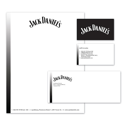
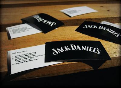
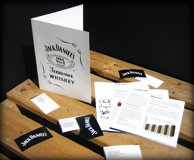
Back in second year we had to pick a company and create an informational brochure about their product. The brochure required high resolution pictures (to be printed obviously), real information, as well as a map.

I chose to switch the normal color scheme and make white the more dominant color over the black. I kept it clean and direct because I feel that's how this type of brochure should be viewed.

I have a digital presentation for the stationary. For the brochure I decided to shoot photos of the brochure in an environment. I feel it adds a lot more interest to the subject. Eventually I plan to present all of my portfolio pieces in a way similar to this.

Hope you enjoy!


Tuesday, May 18, 2010

LogoPond

LogoPond is a site that features the top logos from any member of the Community. The is a section called the Gallery. There are some incredible logos found in here.

From concepts to execution you can post any logos you'd like and other members can critique your work. I have found this site extremely helpful when I'm looking for inspiration on a branding assignment. The criticism is very forward most of the time but it helps immensely if you're serious about having a great end product for your client.

I have yet to land a logo of mine in the Gallery but I am keeping my fingers crossed. For you designers who follow my blog, I highly recommend you bookmark this site. Do some browsing through the Gallery and you'll see what I mean.

Photography Pt. 2

Here is the second part to my current photography Portfolio. I don't do as much shooting as I'd like at the moment and I like to think that this is due to the fact that I don't have a very good camera. So once I get my new camera hopefully I will start digging deeper into photography.

Here is the second portion of photos. Enjoy!


A Ton of Inspiration

Over the past few months I've been referencing the Behance website for inspiration on various illustration styles. The links consist of mostly illustration styles, but there are also a few branding projects, cool photo manipulations, tutorials and there are even a few links to some fonts I thought I might want to download. I need them to be live links, so I figured I would post them on here to share with anyone who is interested.


http://www.behance.net/Gallery/Portraits-Session/258474


http://www.behance.net/Gallery/MY-100-CARDBOARDS/234827


http://www.behance.net/AndreySmirny


http://abduzeedo.com/super-easy-typographic-portrait-photoshop


http://psd.tutsplus.com/tutorials/tutorials-effects/the-making-of-constant-slip/


http://www.behance.net/Gallery/Nike-6_0/234009


http://www.behance.net/Gallery/POPMECH/474273


http://goodblimey.com/tunes/ This link is to a site with thousands of really good song mash ups, all are downloadable.


http://www.typographyserved.com/Gallery/Type-Factory/236344


http://www.behance.net/Gallery/Zombie-Walk-Paris-2009/339473


http://abduzeedo.com/reader-tutorial-easy-digital-painting-illustration-photoshop


http://www.typographyserved.com/Gallery/DOVJENKO-X-KDU-X-ECKO-UNLTD/207740


http://www.behance.net/Gallery/Get-Physical-7th-Anniversary-Compilation/319706


http://www.dafont.com/theme.php?cat=710&text=Contact%3A+%28519%29


http://www.behance.net/Gallery/HURLEY/477469


http://www.behance.net/Gallery/type-expiriences-vol2/478809


http://www.behance.net/Gallery/Moleskine-2/273095


http://www.behance.net/Gallery/drawings___/478690


http://www.behance.net/Gallery/Marinina/223936


http://www.behance.net/Gallery/collaboration/141287


http://www.behance.net/Gallery/Illustration/409135


http://www.behance.net/Gallery/boques/162897


http://www.behance.net/Gallery/No-Strings-Attached/285949


http://www.behance.net/Gallery/ajeva/305440


http://www.behance.net/Gallery/Blackout/169944


http://www.typographyserved.com/Gallery/Typography-Today/376793


http://www.behance.net/Gallery/Gotham-High/345103


http://www.behance.net/Gallery/Sting-One-13-of-2010/486594


http://www.diyphotography.net/creating-that-dave-hill-look


http://www.logodesignlove.com/


This last one is part 1 to a short film called Logorama, it is brand identity. I won't go into detail but you should definitely check it out. (It contains some offensive language)

Saturday, May 15, 2010

Photography Pt. 1

In my third year of school I really started to respect photography. It was a Photo Essay class so your task is to tell a story through images alone. I shoot with the Canon PowerShot SD 750 for now. Once I have the funds I plan to upgrade to a digital SLR of some sort. Any ways here are a few of my favorite shots from the past few years. More to come soon!


Friday, May 14, 2010

Zombified #3


This is the third finished illustration in the Zombified series. I plan to keep the series going for as long as I can. It is a rendering of my friend Justin Renaud. I wanted to give this one something original compared to the others, so I thought a half decomposed face would do the trick.

Here is the photo reference, sketch, and final illustration. Enjoy!

Tuesday, May 11, 2010

Kleenex Designs


These are illustrations for a school project. We were challenged with creating kleenex box designs. The designs were targeted to a wealthy age group. So I thought I would illustrate my designs as appose to using photography because I find it adds more interest. Also because 90% of kleenex boxes you see are simply textures placed over the entire box.

With my illustrations I wanted to treat the box as a "canvas" for a few of the illustrations. There is also a mock up of what the final packaging would look like. Hope you enjoy.

Friday, May 7, 2010

Inspiration #3- Mike Giant


Having a story much like mine, you will probably see why I like this guy so much. He started in the skateboarding scene at a young age, much like myself. Eventually he started writing graffiti, and like most writers got into design from there. He started doing skateboard graphics, which lead to doing tattoos and the he absolutely blew up from there. Now he is the Designer and Owner (from my knowledge) of Rebel 8 clothing company.

I have been following his work for years now and he never ceases to amaze me.

Here is his personal website.

Thursday, May 6, 2010

Zombified #2


For my second illustration in the Zombified series I did a rendering of my girlfriend. When the final was done I still wasn't happy with the piece, so the idea to remove a few thumbs and index's was born.

Here is the photo reference, sketch, and final illustration. Enjoy!

Wednesday, May 5, 2010

Mac Mania


For all you Mac users out there. Here is a link to an abundance of cool Mac downloads and applications. Including Games, graphic editing software, audio and video software, and much much more.

I can't remember how I came across this site, but that doesn't really matter. Here's the link, enjoy!

http://web.mac.com/simon_elliott/simon_elliott%40mac.com/Software.html

Inspiration #2- Tomer Hanuka

A stumble cross this guys work in Juxtapoz Magazine. He has a dirty vector style, mixing textures and shapes to create his images. Not to mention that his eye for capturing an interesting and dynamic image is simply astonishing.

From concept to execution, his work is incredibly inspiring. For a link to his portfolio site: click here.

Tuesday, May 4, 2010

Zombified #1


For one of my final school projects we were given the creative freedom to illustrate any three things we wanted, they did how ever have to be related to one another. After bouncing around several ideas and finally narrowing it down to one, I decided to do a series of three zombie illustrations which I named "Zombified". My goal was set to do three vector based illustrations, using my friends and my self as models.

I will be posting all three illustrations, as well as the reference photos and sketches. I know I know, the reference photos look hilarious before any sketching is done. P.S The "fake blood" is maple syrup, red food coloring and a bit of water, got the job done in my opinion.

My first post will be the one I did of my self. Keep checking for the next three! Hope you enjoy.

: )


I don't think any words are needed for this one.

Trans Canada Trailer Company


I recently finished my 2 month internship with Generator Design & Advertising. They had me on a few really interesting jobs, one of which was the Trans Canada Trailer Company branding.

Tim Treleavan is the Inventor of the R-Escape. This is a new product for families and bike enthusiasts. The R-Escape is a bike trailer which can be pulled behind a pedal bike. Once you reach your destination, the trailer can be transformed into a 2 person tent, equipped with everything from interior lighting to a 12 volt electric heating and cooling fan.

I had the privilege of working extensively on the TCTC branding as well as the R-Escape branding. All of my hard work on this project did not fall on deaf ears because two of my logo's were chosen by Tim to be used as the image for TCTC and the R-Escape.

Tim has also brought the R-Escape to the local event "The Dragon's Den," hosted by Softech Alliance. Everything went well for Tim as he won over the judges, pushing him on to the next stage of the competition. Possibly landing him a spot on the Official Dragon's Den show. Which means my work could be hosted on TV for all of Canada to see! Good luck with everything Tim!

Monday, May 3, 2010

Inspiration#1- Marcelo Oliveira

My first post will be some inspiration.

For several years now, I have been involved with Graffiti. The colours, the style, the creativity, the culture, the attitude- you name it.. I find every aspect of the art form fascinating.

I believe this is were my love for typography started. So here is a link to a Designer I have been following. His name is Marcelo Oliveira and his style is what I hope to one day be able to resemble. Incredible work from this guy.